Elements of good cosmetic packaging design
Nov. 09, 2021
Strolling down any cosmetic aisle in any store, the endless array of colors, patterns, textures and shapes is sure to get people overexcited. Compared to most other product areas, cosmetic and personal care packaging is distinctly creative.
The goal of any of these products is to make the customer look beautiful and feel spectacular. If you are going to convince consumers to try your lipstick, body wash or moisturizer, you need to convince them that your product will take them on a journey to happiness.
This is why certain aesthetics emerge and are often used to create lasting and timeless packaging designs that leave an impression on consumers. When looking for inspiration for your design, and during the design process, keep a few core elements in mind.
Color
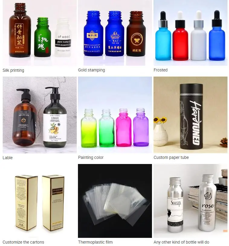
It's no surprise that we're convinced that color plays an important role in cosmetic packaging design. By its very nature, the industry lends itself to the use of a wide range of colors. Although it pops up time and time again, some tried and true color schemes.
Black and white
Individually, black and white are always excellent choices for product packaging, regardless of the industry. Black is a power color. It portrays a sense of luxury, sophistication and timeless elegance. It also helps to provide a certain hard edge or contemplative nature to a brand.
On its own, white usually represents the height of minimalism. Its starkness also portrays elegance and sophistication. When used as a base layer, it serves the dual purpose of softening heavier tones and providing better definition to lighter colors. When paired together, black and white will always prove to be a successful classic color scheme.
Pink and purple
Ever wonder why pink and purple are two of the most popular colors in cosmetic packaging? Well, pink evokes feelings of love and romance, beauty and femininity with a sense of calm. Purple evokes royalty, wealth and luxury. It also symbolizes luxury, independence, and even a bit of mystery.
Both colors capture the basic core tenants of the beauty industry. As a result, they are used time and time again. It may be difficult to distinguish your product from others that try to capture a similar vibe. If you must use either, it is best to use it in conjunction with other colors. You can still capture that core feeling of beauty and luxury while paving your own brand path.
Other color schemes
The three categories above represent the most popular colors in cosmetic packaging. However, there are other options. Warm tones use a combination of reds, yellows, oranges and pinks to evoke enthusiasm, energy and optimism.
Cool tones - shades characterized primarily by blues, greens, purples and similar hues - are intended to convey a sense of relaxation or calm. Neutral or earth tones represent any shade of brown or closely related variations, from russet to gold to tan. Often used in combination with black, white or gray, these shades are reminiscent of nature.
Fonts
Similar to color, the fonts and typography used in packaging convey their own feelings and emotions.
First, there are some basic tenants with letters. Serif fonts are the most traditional font option, conveying a sense of class or being established.
Cursive or script fonts or italic fonts convey sophistication and elegance (and femininity). Bold or all-caps letters indicate powerful, aggressive branding (often used for men's grooming product lines).
Regardless of font and typography, the primary goal is to make sure it is easy to read. A key factor to always consider when determining your text scheme is the type and size of packaging you plan to use.
Whether it's artistic, whimsical, bold, arrogant or elegant and sophisticated, choose something that best represents your brand, is unique and stands out from the competition. The more you can set yourself apart, the more likely you are to shape your identity.
Graphics
The final major design element of cosmetic packaging includes graphics. And, as any trek to your nearest cosmetics and beauty store will show, the world is indeed your oyster.
The main design styles you see elsewhere are often found in cosmetics. Minimalism, geometric, art deco, floral, traditional, modern, contemporary, natural, abstract - these are just the basic potential styles. Many brands combine elements and forge their own path.
That's what we suggest. There's no right or wrong here - hand-painted florals or bold industrial geometrics can prove successful based on brand goals and consumer response.
At this point, it sounds like a broken record, but in an industry and market where many brands seem to mirror each other, uniqueness stands out.
When putting all these design elements on your product packaging, you need a cohesive presentation. One that is authentic to your brand. One that appeals to your target demographic and will prove most attractive wherever they buy your product.


